Causality in disparities spatial analytics
The conundrum and common solutions Naïve/aspatial methods analyzing spatial data overestimate effects because observations inherently have spatial autocorrelation; for instance, life expectancy shows a classic (naïve) Pearson correlation even with the statistically meaningless FIPS census tract identifier (Pubmed), yet a proper spatial lag regression correctly yields no such relation.
There is a long tradition of analyzing and interpreting spatial data, e.g. from agriculture and economics to astrophysics Jstor (Stigler, 1999, p. 193). Yule (1899 Jstor) for example has reported in 1899 on factors responsible for changes in poverty (‘pauperism’), using census data from England and plain (naïve, i.e. not spatial) regressions (his study is showcased in Freedman Jstor (2005). [i]
Any data collected on Earth is spatial: they come from specific locations on Earth. [ii]
Few studies test the extent of spatial nonindependence and then apply proper spatial analytical tools; most rely on naïve or a-spatial analyses. Few, like Kramer et al. (Kramer, Black, Matthews, & James, 2017 Pubmed), for example, reported upfront their main variables’ Moran’s Is, and then analyzed the spatial data using spatial analytic models, which directly account for the spatial ‘contagion’ effect.
Modeling spatial non-independence with modern tools The independence of data points is a common assumption in most analytical models. When data is ‘relational’, i.e. data points (persons, regions) are related in some manner, their contribution to the analysis literally diminishes. At one extreme, if for example two spouses respond completely identically to the question ‘How many children you have?’) their responses become one data point, rather than two. Analyses ignoring this data ‘coupling’ would yield a naïve/non-dyadic biased view (Kenny et al., 2010. Pubmed). The same logic applies to over-time data, like height measured after reaching adulthood: height doesn’t need to be measured twice when similarity across time is expected. I delve below into the intricacies of how and why spatial structuring artificially magnifies the naïve associations, [iii] but I provide a quick preview of the solution: any spatial outcome analyzed has behind it a spatial ‘autocorrelation’ effect co-occurring, without which the effect of any predictor will artificially appear inflated. Such data structure is very similar to dyadic and ‘related samples’ repeated measurements. [iv]
The non-independence among data points (here areas or regions) has been termed ‘contagion’ between cases (or ‘interference’, Jstor, spatial ‘interaction’ Jstor , or ‘confounding due to location’ Pubmed. The manner in which spatial ‘auto’-correlation [v]affects statistical estimates is rarely conveyed intuitively. Firstly, when non-independence of individual cases is operating, the expected value is not the arithmetic mean anymore, but becomes a weighted mean.[vi] From a causal inference standpoint, this contagion effect implies that a certain region targeted by a policy-driven intervention has the potential of affecting (and be affected by!) its neighboring regions, above and beyond the intervention. Although statistical independence and lack of a causal relation are distinct concepts, when data nonindependence occurs, one must correct for it before investigating causal relations. Inferring causal relations from observed (plain) correlations between variables, and pursuing their sources can be achieved using the classic method of path analysis (Wright, 1921, Scirp), see also Annotated bibliography) .
Most reports in medical and health literature are based on analyses that effectively drop the spatial structure and only retain the simple table-like component of the spatial data, (what Geographic Information Systems, GIS, analysts call the ‘attribute table’). [vii] I provide in an online document at tinyurl.com/SPATIALPRPR a list of analyses (In Stata) that advance from simple (naïve) regressions to multilevel spatial structural models; I also built a more intuitive deconstruction, using plain Excel, and showed how to add the matrix of neighboring relations to the table data, and manually run spatial lag regressions: Tinyurl.com/BLOGSTATS1 .
Unfortunately, the classical explanations of nonindependence focus on groups of cases, in the Anova-tradition, or on 1:1 (dyadic) designs, and do not transplant well into the spatial ‘mutual dependence’ context. Whereas groups like schools are generally mutually exclusive, that is, each student (a case) belongs generally to only one school, with spatial data the ‘group’ (or cluster) that each case ‘belongs to’ is made up of several other cases in the same dataset, and these ‘groups’ overlap many times over, similar to individuals belonging to several friendship groups. This means conversely that each region acts as a ‘group member’ in as many such ‘groups’ as the number of its spatial neighbors, because each region defines its own group, by rounding up its neighbors. Using the example of the US state of Connecticut (CT), MA is in the group of CT’s neighbors, but CT also counts as MA’s neighbor. CT has three neighbors: NY, MA, and RI, so CT’s life expectancy (LifeExpCT) is influenced by all the other 3 neighboring states’ life expectancies, due to a host of social processes (including e.g. residents moving between the states), so we can say for instance that LifeExp(NY & MA & RI) -> LifeExpCT, but because CT is one of the 5 neighbors of MA (along with NH, VT, NY, and RI), we also have LifeExp(CT & NH & VT & NY & RI) -> LifeExpMA, which makes visible the fact that there are feedback-loop relations arising between neighboring states, due to their spatial adjacency (‘self-reinforcing’ effects). Figure 1 shows how such influences flow, by portraying only CT and MA: only same ‘self’ cross-variable effects are considered in naïve analyses (the common association setup: CT has higher than mean value on a variable, and also higher than mean on another, etc.), while spatial analyses also model the same variable effects: how CT and MA values of the same variable relate, and why.
Fig. 1. Sources of naïve (N) and spatial (S) effects; two US neighboring states 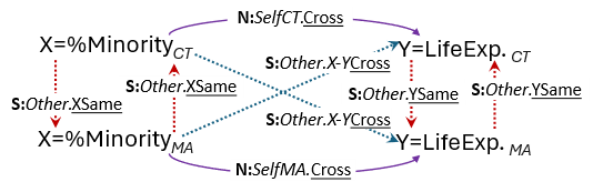
Notes: Two regions with Self & Other region links and with Same & Cross variable links: sources of plain/naïve/a-spatial (N:) correlations – naïve – continuous curved arrows; interrupted arrows: links due to spatial structure (S:); other-region & same-variable vertical arrows: the basis for ‘auto’-correlations (S:Other.XSame); diagonal arrows (S:Other.Cross) are other-region & cross-variable influences (generally not modeled): CT = Connecticut, MA = Massachusetts; LifeExp: Life Expectancy.
The inherent spatial structure results in ‘excess similarity’ among neighboring regions beyond mere randomness, and explains why the expected level of spatial independence (e.g., Moran’s I) is not zero, but E(I) = (-1)⁄(n-1), (see proof in Griffith’s Appendix, Worldcat) . [viii]This peculiarity of spatial data is rarely fully explained: the null hypothesis ‘position’ is shifted away from zero, often ‘upwards’, and hence the statistical test, in this binary variables case the chi-squared test, is more likely to conclude the presence of a naïve relationship, when no true spatial relationship is there.
Spatial data therefore inherently contain at least three types of ‘clusterings’, and they all may shift the naïve estimates of effects, in rather complex ways.
(i). Individual residents are ‘clustered’, e.g. in census tracts (Gelman, Shor, Bafumi, & Park, 2008, GDrive) ; this is the classic ‘students clustered in schools’ setup from multilevel designs;
(ii). Census tracts themselves are ‘nested’ in counties. Note that with areal data, all lower-level regions (census tracts) are included in the data, i.e. there is no sampling of them: the whole population spatial data availability creates another unique statistical challenge, because probabilities associated with classic estimates are not equally meaningful. The spatial structuring of the data adds a third layer of ‘clustering’, based on
(iii). The neighboring or adjacency natural spatial relation (‘adjacency spatial structure’, (Tiefelsdorf, 2000, p. 39, Worldcat) : one can literally consider every region an ‘ego’, with and its neighbors as ‘alters’, using common sociometric language (Coleman, Katz, & Herbert, 1966, p. 70, Worldcat) . [ix] I note that the spatial dimension can be utilized as an ordering criterion either in a sociometric spatial manner, i.e. a region connected to its natural adjacent neighboring regions, or continuously, by marking a region’s location as latitude and longitude (a third dimension would rarely be needed analytically); geographically weighted regressions is a common solution in this continuous space context (Brunsdon, Fotheringham, & Charlton, 1996) Jstor , vs. the polygon boundary related areas I consider here.
With these clustering structures present, spatial areal data at more than one regional level require statistical methods that can model both the multilevel and the spatial non-independence structures; multilevel spatial path analysis (or SEM, if latent variables are modeled) is such a natural option: no spatial multilevel models have been published, to our knowledge.
Properly accounting for the ‘mutual influence’ induced by spatial structure requires the specification and estimation of spatial effects. The spatial econometrics literature has provided two handy tools, the spatial lag and spatial error regressions (Anselin, 1988), Springer p. 22, wherein one adds an additional element in regression models that accounts for the spatial structure, either as a co-predictor, or contained in the residual errors. The spatial lag method is a simple approach which combines the neighbors of each case (e.g. county) in the data into a global ‘other’, by creating an average score of all the neighbors’ values for each outcome; I posted an Excel setup for doing so by hand for a dataset of the 49 contiguous US states at tinyurl.com/SPATIALPRPR (explained at Tinyurl.com/BLOGSTATS3 : the spatial lag is simply a multiplication of two matrices: a column vector of the original variable, and the weights matrix of ‘who is whose neighbor’ (Anselin, 1988, Springer, p. 23).
The spatial lag correction opens up a better modeling intuition for the extent of the bias induced by naïve/a-spatial analyses, coming from a parallel graphical method. Sewall Wright’s >100 years old path analytic invention decomposed associations into causal and non-causal components; it has been expanded to provide a formal causal calculus (Pearl, 2017, Ucla.Edu) . One simple method to account for the spatial nonindependence is to include the outcome’s (first) ‘spatial lag’ as a second predictor (Rey & Boarnet, 1999, Springer) . This ‘self’ (i.e. same variable) spatial lag captures the influence of neighboring regions on each region, often resulting in attenuating the primary (naïve) effect of interest. Classic proofs going back to 1946 (Cramer, 1946, Worldcat ), cited in (Pearl, 2017, Ucla.Edu) show by how much, if one ignores a second predictor (which correlates with the first predictor), the estimate of the effect is biased (and the corrected effect can even change signs: >0 vs. < 0). The extent of the change (or bias) can be directly gauged visually, ‘walking through’ the graphical path model: the (naïve) correlation, in the two predictor model, is now the result of two pathways: a direct effect, and an indirect connection through the second predictor: the ‘tracing rule’ (proved incidentally by Kiiveri et al., 1984 CambridgeJournals , and Moran, 1961) Aiaa.Org ) yields this result right away. [x]
I illustrate the CDC’s Life Expectancy[xi] online data with census tract, county and state level Life Expectancy at Birth 2010-2015 layers, and variables from the CDC Social Vulnerability Index online data, available for census tracts and counties (Centers for Disease Control, 2024), which contains income, percent minority, percent poverty, and other fields. The data and Stata and Mplus syntax are posted online (E. Coman, 2024, Dataverse.Harvard) ; direct link Tinyurl.com/SPATIALPRPR ).
When Moran I’s are sizeable (.4 or larger) and statistically significantly different from zero, according to pseudo-p values, which are random permutations of the observed values over the locations (Anselin, 10/12/2020) Geodacenter, this indicates the need to correct for the spatial ‘contagion’ effects. The means of each variable shift, as expected, mainly because of how each higher-level region aggregates lower-level ones, in terms of different populations of residents. The ranges also differ across census tracts, counties or states, with larger regions showing smaller ranges of values. Notably, these means do not also represent the US population as a whole, but the regions they summarize.
Table 1 presents the naïve associations between the three main spatial variables, %Minority and Life Expectancy, across census tracts and counties, respectively (state-level relations were less meaningful), along with spatial associations derived from spatial lag path models shown in Figure 3: the correlation between the spatial variables adjusted for their auto-correlations. I note that there is little agreement on how to conceptualize a non-directional spatial coefficient of association between two spatial variables (but see Lee, 2001 Springer , or Tjøstheim, 1978 Oup , implemented through the cor.spatial function in the R package SpatialPack, (Osorio & Vallejos, 2019, R-project)
Table 1. Zero-order naïve/a-spatial Pearson correlations and standardized spatial associations between %Minority and Life Expectancy; census tract and county levels

Notes: NCsTr = 60,609 census tracts and NCnty = 3,055 counties; spatial lag correlation coefficients are residual correlations between the residual errors of each variable, after its own lag is entered as its predictor. The models are simply: SpatialLag (Y1) -> Y1 <- Residual (Y1) <-SpatialAssociation (Y1Y2)-> SpatialLag (Y2) -> Y2 <- Residual (Y2) (detailed in Figure 3)
Pearson correlations estimates are inflated compared to their spatial counterparts.
While such discrepancies appear small, they are more consequential when spatial data is used to investigate possible measurement structures of constructs, like social vulnerability (Karaye & Horney, 2020) ScienceDirect or structural racism (Lukachko, Hatzenbuehler, & Keyes, 2014) ScienceDirect . There are also shifts (more evident at state-scale, however) in statistical significance levels of estimates of effects, not seen at census tract or county level, where analyses use large samples, over 60,000 census tracts and over 3,000 counties, which again cover the entire population of such regions. On the other hand, the census tract and county estimates from their respective spatial lag models are refreshingly similar (or stable across geographic scale (Marston, 2000, ResearchGate)
Fig. 2. Spatial lag path model to derive a spatial association
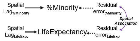
Notes: Dotted lines are paths set to unity (=1); double lines are the ‘self’ spatial lag effects, same variable.
The relationships between the same pair of variables differed by level, e.g. %Non-White <-> Life expectancy, county vs. census tract level. Plus, each can directly cause each other, even if one direction might be predominant, i.e. a variable is a “greater cause of the other”(Kenny & Harackiewicz, 1979), p. 377. Academia.Edu) . Because the data literally doubles by generating spatial lag derivations, path models allowing for both direct effects (in both directions) can be easily estimated by conveniently utilizing the spatial lag of each variable as a ‘natural’ instrumental variables (IV, (Maydeu-Olivares, Shi, & Rosseel, 2019. UGent) , we include in the online Appendix tinyurl.com/SPATIALPRPR illustrations of such cyclical models).
Conclusions The spatial lag expansion of the regular regression/path analysis-based modeling I showed opens up exciting new analytical prospects. The combination of spatial analytics and the classical multilevel models invites better clarifications of what ‘clustering’ and non-independence mean, and how they happen. One can for example investigate census-tract level effects of percent minority unto life expectancy, while taking into account the ‘nesting’ of census tracts within the ‘higher-level’ counties. This option brings about the second type of data nonindependence, which is a combination of the classic spatial ‘auto’-correlation, and the mere ‘belonging to a group’ type of multilevel clustering: census tracts belong to the same county both by virtue of spatially ‘sitting’ in a larger region. One can moreover examine separately the extent of this 2-level clustering by assessing the intra-class correlation (ICC, (Haggard, 1958. Worldcat) , which is a distinct measure of nonindependence from the Moran’s I. ICCs can be generated also from proper spatial (linear mixed, or SEM multilevel) models.
Tests of the lower-level census tract effects of percent minority on life expectancy can be modeled also as higher level (county, e.g.) random coefficients, at which level one can also examine whether county-level predictors, like poverty, predict variability in this effect itself, across counties: all this while properly accounting for the spatial structure inherent in the regional/geographic data. One can directly also test for example structural and systemic effects, like higher-level (e.g. state or county) factors affecting lower level (census tract) indicators or effects, net of lower-level effects. An example would be county level political leaning of legislating bodies impacting the average level of both life expectancy, and the size of the ‘percent minority à life expectancy’ effect manifested across lower-level census tracts. Such models expand the scope of health inequality inquiries to consider also macroeconomic policy implications (Mitchell, 2001. Gla.ac.uk) . Modeling both spatial and temporal ‘auto’-correlations is another exciting extension. A dyadic view of the data can be also taken, recognizing that all spatial variables are quite like a ‘self’ variables, while their spatial lags appear in the data as a second set of ‘the other’ variables (Wickham, 2023. SEMj) .
A note of caution is needed: statements derived from analyses of regional (areal) data alone (without individual-level resident data) require a higher burden of proof to be stated as cause-effect findings. An analysis of differences in racial/minority composition and say mortality due to cardiovascular diseases across US counties could not be stretched to conclude that one’s race/ethnicity causes mortality per se, but that such regional mortality rates differences do exists, and go hand-in-hand with regional racial/ethnic composition differences.
Further extensions Note that diversity itself differs conceptually from segregation, and some have found some ‘benefits’ of segregation, i.e. a longer expected longevity for residents in segregated areas (Chetty et al., 2016, Pubmed) . Similarly, income and income inequality (e.g. Gini income inequality coefficient (Ceriani & Verme, 2012, Springer ), or relative income (Wilkinson, 1992, p. 168, Pubmed) , have distinct effects on health (Kawachi & Kennedy, 1999, Pubmed) , and further investigation could examine their combined effect on life expectancy. Secondly, while I examined the role of income, I have not modeled income inequality per se separately as another potential factor. ‘Income inequality’ might emerge as a predictor of differences in health outcomes and life expectancies, so well-aimed public policies might be different from mere increases in minimum wages, but can involve tax and redistribution policies (Avendano & Kawachi, 2014, Pubmed) . Correspondingly, disparities or inequities in poverty can be derived and examined as determinants, like the difference in the rates of poverty among White residents vs. those among non-White residents.
The interplay between income and poverty in affecting health outcomes, and to what extent they overlap, is actively researched (Khullar & Chokshi, October 4, 2018, HealthAffairs) , but needs further investigations. A wider causal model of inter-relations between regional indicators like income and poverty, and health outcomes, on the other hand, may be positioning income for example on different causal pathways leading to better or worse health, which can include additional structural, systemic, and institutional racism potential factors, as well as what is increasingly termed ‘political determinants of health’ (Mackenbach, 2013, Eur.nl )
While analyses like the spatial lag models can provide answers for potential region-based interventions aimed at modifying living conditions, the statistic answer to ‘how much this census tract’s (or county’s) average life expectancy might increase if one improved its median income by a specific amount’ would not translate into real-life changes, as the processes underlying regional differences are not merely occurring at the region level, but are complex social and economical processes that involve individual residents, neighborhoods, economic agents, etc. (Chetty, Hendren, Kline, & Saez, 2014, Nber.org; Mitchell, 2001; Wilkinson, 1992, Gla.ac.uk Pubmed) ‘People poverty’ for instance is distinct from ‘place poverty’, which reflects more ‘public necessities” than individual paucity (Martin & Morrison, 2003), p. 246) Worldcat , and they might even be inversely related (Powell, Boyne, & Ashworth, 2001) BristolU . Moreover, different factors might be responsible for differences between countries, (e.g. differences in health care, individual behaviors, socioeconomic inequalities, and the built physical environment (Avendano & Kawachi, 2014, Pubmed), vs. lower-level regions, since geographies are ”a nested hierarchy of differentially sized and bounded spaces” (Marston, Jones III, & Woodward, 2005, ResearchGate)
The extent to which regions represent also distinct administrative boundaries (like counties), with local governing structures able to affect residents’ health though localized policies, or mere geographic areal demarcations (like census tracts, or ZIP code tabulation areas, ZCTAs), will also have a say in how strong the ‘effects’ would be across such geographies; this relates to the ‘modifiable areal unit problem’ (MAUP, (Openshaw & Taylor, 1979, SemanticScholar ) which can be compounded by areal misalignment, i.e. when one same smaller region ‘spills over’ more than one larger region (Zhukov, Byers, Davidson, & Kollman, 2023, Cambridge). . Regions can also be literally modified, thereby concentrating within or dividing social groups across politically drawn boundaries, with effects on health (Rushovich, Nethery, White, & Krieger, 2024, ResearchGate) . School districts for instance in the US are rather loose such regional units, yet due to local education boards’ setup and administrative powers over the schools in their area, will directly affect some health aspects of school-age residents, e.g. by accepting or rejecting free-school lunch offers from the US federal government during Covid-19 (Kashyap & Jablonski, 2024 Wiley) .
*** The last part, # 7, will briefly go over some remaining challenges and opportunities for both advancing this field, and for better explaining it, like the ‘equivalence of potential outcomes (‘Rubin’, more properly Cochran’s… see note viii below and image insert) and causal calculus (Pearl) approaches to causality’.
ENDNOTES
[i] “The number of paupers in one area may well be affected by relief policy in neighboring areas. Such issues are not resolved by the data analysis” ((Freedman, 2005), p. 1063, 2Wiley ). Several methods for analyzing spatial (or geo-referenced (Vallejos, Osorio, & Bevilacqua, 2020, Worldcat ) data exist (a taxonomy is in (Anselin, 1988), p. 32); a simple spatial correction model is the Cliff and Ord’s (Cliff & Ord, 1973, Worldcat ) spatial ‘autoregressive’ model (also called the spatial Durbin error model, (Anselin, 1988)), which is informed by Whittle’s two-dimensional linear autoregression (Whittle, 1954, Jstor ), see (Kelejian & Prucha, 2004) ScienceDirect ). Despite the availability of such tools for correcting for spatial nonindependence of data (some free, like (Anselin, 2021, ) , where this analysis is labeled spatial lag regression), there are rare reports of proper spatial analyses of geographic/regional data. Prompted by the increasing availability of such aggregated regional data (e.g. life expectancy (National Center for Health Statistics, 2020, NationalAcademies ), a slew of research reports have found associations between purportedly causally remote constructs, like redlining (as indicator of historic structural racism) and diabetes prevalence in modern times (Egede, Walker, Campbell, & Linde, 2024, Pubmed ).
[ii] Location information is not always collected and processed, however, and at times it is not essential to research inquiries. Moreover, health-relevant data collected from people are always to some extent non-independent: at the largest scale, all humans breathe (more or less) ‘the same air’ from the same atmosphere, so there is a ‘clustering’ due to such common living conditions. Depending on what outcome is investigated and who is recruited, or how data is assembled, however, the impact of such ‘excess similarities’ ranges from somewhat ignorable, to analytically problematic.
[iii] Classical analytical methods had to be adapted to handle data that are ‘correlated’ (e.g. the chi-squared test (Cerioli, 1997 Jstor), and such adaptations have a long history (Haggard, 1958, Worldcat p. 5); in social psychological research the topic has been extensively handled under the ‘nonindependence’ framework (see e.g. (Kenny, Ackerman, & Kashy, 2024 ResearchGate; Kenny & La Voie, 1985 ResearchGate) . Comparing the similarity within groups to that between the groups is the classic logic of analyzing differences in averages, and variability sources (the analysis of variance method, (Kenny, 1987, p. 224 DavidAKenny.net) . The sources of ‘excess’ similarity in spatial analytics however differ, because of the natural spatial structure adds a distinct “contagion” in the data.
[iii] When data is collected from a sample of patients twice, for example, applying an ‘independent samples’ t-test will show different results compared to the proper companion paired t-test (Coman et al., 2013, Frontiers) . Similarly, a test comparing life expectancy means, say between US Northern vs. the Southern states, would need to be adjusted to account for the inherent ‘spatial pairing’ of cases. This differs from temporal ‘pairing’: whereas time indexes a natural linear pairing, such that an observation is more similar to its prior (and subsequent) temporal pair, space induces such similarities across several ‘prior’/lagged/near-by regions, the spatially adjacent ones.
[iv] When data is collected from a sample of patients twice, for example, applying an ‘independent samples’ t-test will show different results compared to the proper companion paired t-test (Coman et al., 2013, Frontiers). Similarly, a test comparing life expectancy means, say between US Northern vs. the Southern states, would need to be adjusted to account for the inherent ‘spatial pairing’ of cases. This differs from temporal ‘pairing’: whereas time indexes a natural linear pairing, such that an observation is more similar to its prior (and subsequent) temporal pair, space induces such similarities across several ‘prior’/lagged/near-by regions, the spatially adjacent ones.
[v] Economists call it more properly “correlated observations” E(yi, yj) ≠ 0 ((Cameron & Trivedi, 2009, Stata.Com p. 81): it induces an excess resemblance, or similarity, compared to plain randomness, in the data. If the life expectancy at birth in one state does not provide any information about the life expectancy in its neighboring states, there is no spatial autocorrelation: the regions are independent. Yet, when the life expectancy of one state does influence or constrain our expectations for neighboring states (reduces the number of possibilities, or the ‘sample space’, (Conover, 1999, Worldcat), – making predictions more precise – the regions are no longer independent.
[vi] When cases are not equally probable (Pi ≠ 1 / N), each case contributes more/less to the overall expected value. Two more layers add to the conundrum, making even the simple average of regional or areal aggregate values, like life expectancy across census tracts, less meaningful: (i). Populations differ across regions; and more importantly for our illustration; (ii). The value of one region depends on the values of its neighbors. (i). The population-size comparability issue is visible if one considers a region with say one resident expected to live for 95 years, and another with 100 residents expected to live for 85 years: the two region arithmetic average of 90 years clearly does not represent the 101 residents collective population: the proper solution is instead a population-weighted average, here simply (95*1 + 85*100) / 101, or 85.1 years. This particular issue is visible when comparing the arithmetic means of the same variable across different levels: states, counties, and census tracts: these values will differ. (ii). The classic arithmetic mean formula for the mean is in fact an outcome of the ‘expectation’ approach to finding the typical value, in which when each individual data point is equally likely (Pi = 1 / N), the sum of the products of the variable values (Yi) and the probability of each value (Pi) falls back on the common arithmetic formula = Σ Yi * Pi = Σ (Y i * 1) /N.
[vii] This ‘loss of information’ is not commonly visible, because life expectancy data at US states level for example appear ‘complete’: each state has a value. The ‘missing data’ component is made visible when the data structure of the complete geographic data is revealed: such data contain in fact a set of distinct files, collectively called a ‘shape’ file. Some analytical software make this evident by specifically providing ways of re-integrating attribute data files (like life expectancy per state) with their geographic ‘twin’ (the shape file): Stata’s sp analytic module is such a tool, as is R’s terralib, e.g. (Bivand, Pebesma, Gomez-Rubio, & Pebesma, 2008, Worldcat p. 51), besides mapping software dedicated to such data structures, like GeoDa, QGIS, or ArcGIS.
[viii] Consider a simplified example where each state’s life expectancy is classified as either ‘high’ (1, e.g. higher than the national mean) or ‘low’. In this case, a table indicating which states are immediate neighbors, which helps define neighboring relationships among states, is the typical spatial weights matrix (a ‘spatial link matrix,’ (Tiefelsdorf, 2000, Worldcat p. 38). If we tried to randomly assign 1’s and 0’s across all US states, and start with 1 for say Connecticut (CT), its three US neighbors (Massachusetts, New York, and Rhode Island) should get some random combination, like (1,1,0), whereas (1,1,1) or (0,0,0) would indicate ‘perfect’ ‘auto-correlation. NY neighbors MA too, and it should have such a random combination around it (under independence), but assigning NY neighbors’ random values conflicts now with the choice already made for CT. This interdependence, driven by spatial proximity, makes it (nearly) impossible to simulate perfect randomness across a map. This phenomenon underpins the classic ‘map coloring problem’ (Parks, 2012, Oro.Open and explains why we cannot generate ‘completely random’ spatial values.
[ix] More appropriately even, we can talk about many ‘one-to-many’ (Kenny, 1994) Worldcat relations, in which each region is both an ‘ego’, and an alter too, for as many of its neighbors (Hagood, 1943, Jstor . With two clustering structures present, spatial areal data at more than one regional level require statistical methods that can model both the multilevel and the spatial non-independence structures; multilevel spatial path analysis (or SEM, if latent variables are modeled) is such a natural option: no spatial multilevel models have been published, to our knowledge.
[x] Note that adjusting for the values of a third variable has another direct intuition: one simply assesses the relation between the two focal variables, at each level of the third, and averages these level-specific effects across the third variable (Pearl, 2009, p. 80, Ucla.Edu
[xi] Life expectancy is calculated from ‘life tables’ of populations (or regions), which contain number of residents, and number of deaths within age rages. A classical method to derive it is Chiang’s (1968, Worldcat.org), although other have been proposed (e.g. (Silcocks, Jenner, & Reza, 2001, Pubmed , see (Eayres & Williams, 2004)) Pubmed . Life expectancy is the area under the curve from a survival curve (Chetty et al., 2016): in a simple graph of percent alive (or probability of surviving, on the vertical axis) as a function of age (horizontal axis), this area means the average length of life (at a certain age, Modig, Rau, & Ahlbom, 2020, Bmjopen . Of course, life expectancy is in itself a collective construct and a future-pointing concept, using today’s data on mortality, to derive likely life span for those born today: it can therefore be largely influenced by temporal events, like the Covid-19 epidemic, which lowered life expectancy in the US by 0.33 years (Yan et al., 2024), Pubmed and also widened the gender gap (Hayes & Gupta, 2023, Pubmed .